Hottest July on record?
Craig Shearer - 28th August 2023
One of our members emailed us last week asking about a climate change denier’s blog article.
“I got this email from a mate (who’s down a few rabbit holes) and I don’t have the knowledge to evaluate the content. Have you heard of John Dee or can you shed any light (or darkness) on the article?”
The blogger is John Dee, writing on Substack. Substack seems to be a platform where a lot of anti-science and conspiracy theorist types congregate, attempting to monetise their opinions… but I digress. (And, likely there are plenty of valid writers on that platform too).
John claims he’s a former Public Service Ombudsman for the UK government and one-time NHS “suit”. John Dee is likely a pseudonym - perhaps the “Dee” is the first letter of his surname. He claims to be an expert in “crunching numbers”

And, of course, he uses a picture of Galileo as his profile pic, hardly a sign of authenticity!
The article our correspondent forwarded to us is titled “Liar, Liar, Pants on Fire”. I looked it up online and located the page - disappointingly, it says “This post is for paid subscribers”

Ah, well no problem, because our correspondent emailed us the body of the article forwarded from his friend, so I could have a read of it anyway.
The intro of the article states:
“The Mainstream media are attempting to convince the public that July 2023 was the hottest month on record but is this true?”
So, I see where this is going. Reading the article, I challenged myself to spot the flaws and figure out how we can know that what the author is saying is bollocks, or bullshit, or whatever your preferred term is for this sort of stuff.
He starts out by complaining that where he lives he remembers the July of 1976, which was extremely hot, and comparing it to his July of 2023, which he reports was chilly. So, there we have cherry-picked data. For a supposed statistician, he should know better, but I’ll give him some leeway as it’s just the introduction to his article and he’s just warming up.
He references an article from The Guardian, that “July was the world’s hottest month on record”, and takes issue with that.
The next thing he does is to present a graph, pictured below, that shows a flat line.
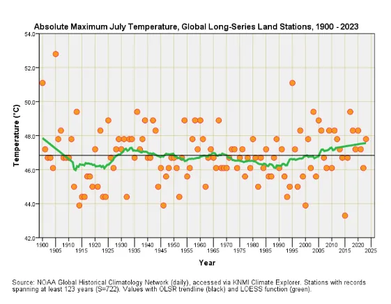
From this flat line we’re meant to conclude that there is no global warming. The thing I wondered is where he got this data. From the text of the article, he states that the data is public, and that it can be retrieved from the Climate Explorer website.
From his article:
“Let us get real for a moment and take a look at the profile for the absolute maximum daily July temperature as recorded amongst 722 long-series GHCNd weather stations that possess records stretching back at least 123 years. Anybody wanting to run this analysis for themselves can do so by clicking here”
So, I think the swindle here is that people tend to believe fancy graphs. Very few people will bother to dig into the data, or possess the technical ability to do so.
I followed the link to the Climate Explorer website and tried to pull the data myself. But I’m then faced with choosing which data I should request.
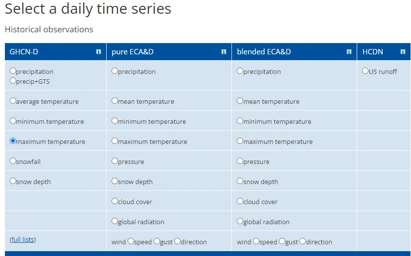
Fiddling about, I managed to select the Maximum Temperature records from weather stations near the centre of the UK stretching back 123 years.
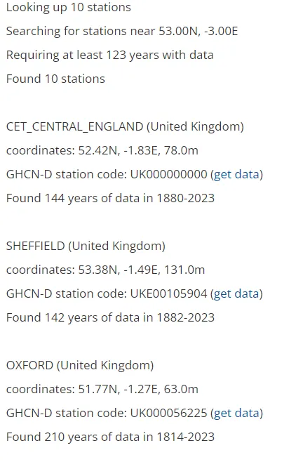
OK, so I can pull individual station data. I randomly clicked on the CET_CENTRAL_ENGLAND one. This came back with a page with a bunch of graphs, showing me (not an expert statistician), some seeming trends. Should I look at this graph, which seems mostly flat though sort of upwards:
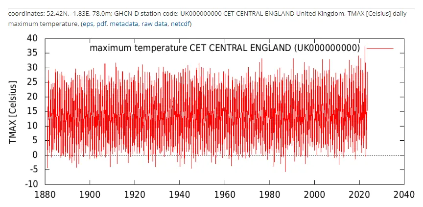
Or should I look at this graph, which, to my eye, shows an upward trend:
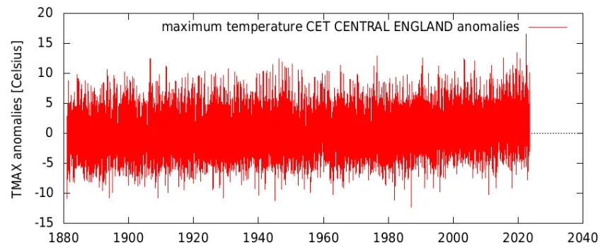
For the record, I know enough about statistics to recognise that I can’t just eyeball a graph and get a valid result out of it.
I think the point here is that a novice in the area is hardly likely to come to the correct conclusion about the data, especially when it’s cherry picked.
He goes on to explain that the line on his graph is a linear regression (even providing a Wikipedia link to what a linear regression is!). I think he’s figuring his audience is a bunch of rubes, who are seeking out his non-expert opinions on climate change for validation of their own misinformed feelings about it. I suspect he’s right about that.
In the final paragraphs of his post, he states:
“This places us deep into confounding variables territory since we’ve got to consider changes in cloud cover, daily sunshine and urbanisation – and these three factors are just the start of a very long list that needs to be considered before we go blaming fossil fuels.”
What he’s doing there is putting impossible expectations of having a precise model of how everything works before we can decide that global warming is happening and that it’s caused by humans burning fossil fuels. This is a classic tactic of deniers, moving the goalposts, or expecting perfection in the science before being able to spot the bigger trends.
So, all in all, the article is a good demonstration of a number of skeptical points:
-
The power of cherry-picked data
-
That it’s easy to lie with statistics
-
That we shouldn’t take the word of non-experts in any area of science (John Dee isn’t a climatologist)
-
That we shouldn’t accept the opinions of a single scientist (even if John Dee were a climatologist with an outlying opinion, we shouldn’t accept it)
Finally, the article is humorously and entertainingly written. But the worrying thing is that it’s wrong, and pushing an agenda of climate change denial to an audience that laps that sort of thing up.
The last sentence in his article gives a link to a YouTube video denying climate change. It’s by Ivor Cummins, a name familiar from many Voices for Freedom articles. It really does seem that birds of a feather flock together.